Pentland Brands - Rebrand
Overview
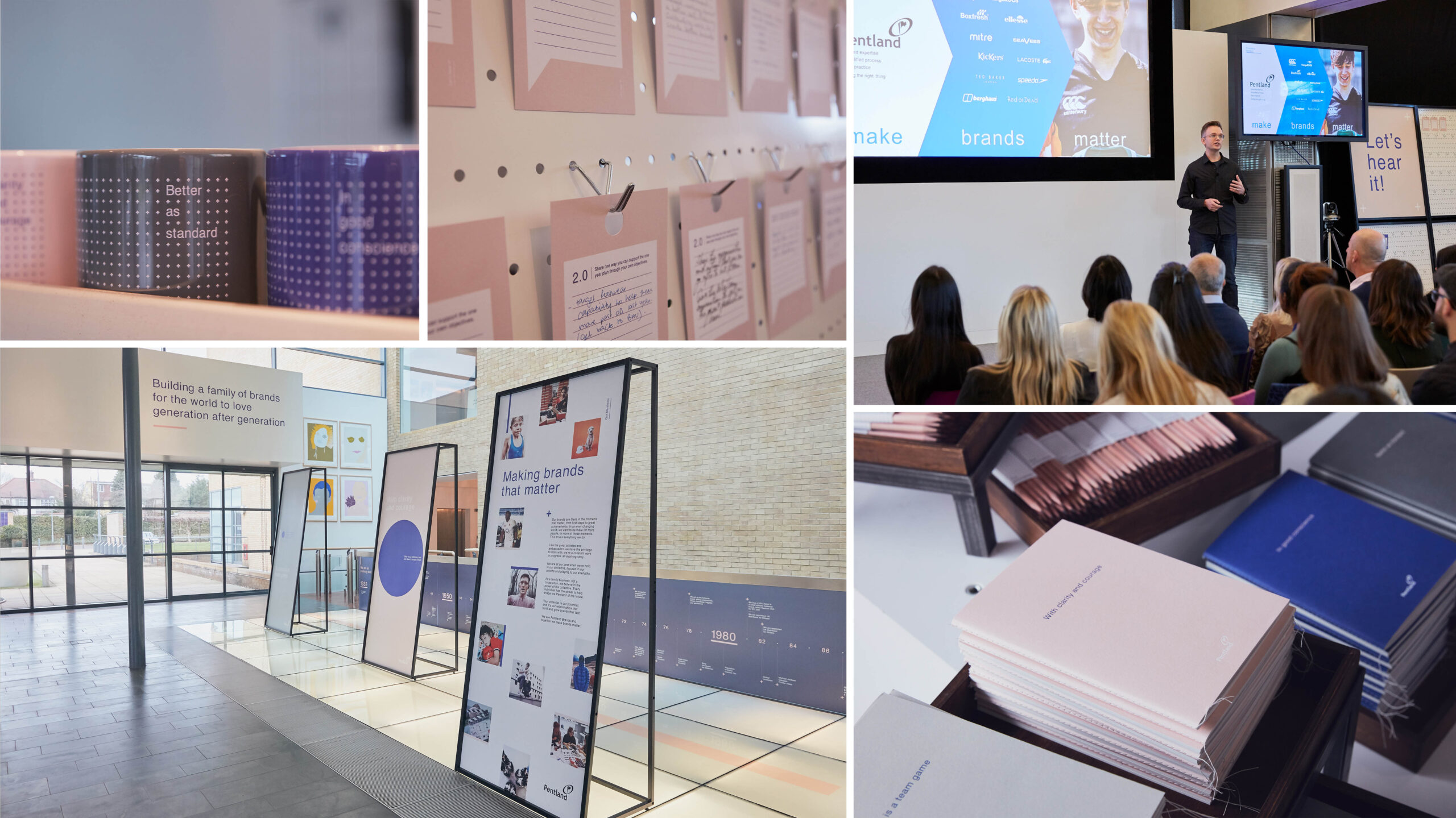
Pentland Creative was tasked with launching this change at the beginning of 2018 with a rebrand that would resonate inside the business and with external partners. It was important that we didn’t just create a new look and feel, but also helped shift the culture of the business with an updated tone of voice.
The creative brief asked us to portray the business as less corporate, more human and to better represent Pentland’s culture internally and externally.
Winner of 'Best Internal Rebrand' at 2018 In-House Design Awards
Client
Pentland Brands Plc
Role
Brand Guardian
Lead Designer (part of team)
Art Direction (part of team)
Year
2018
Agency
Pentland Creative Agency
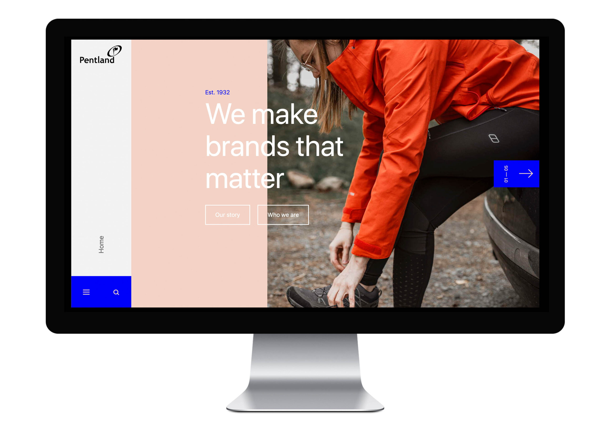
The brand identity was designed to be fresh, future facing and contemporary in the field of sports, fashion and lifestyle.
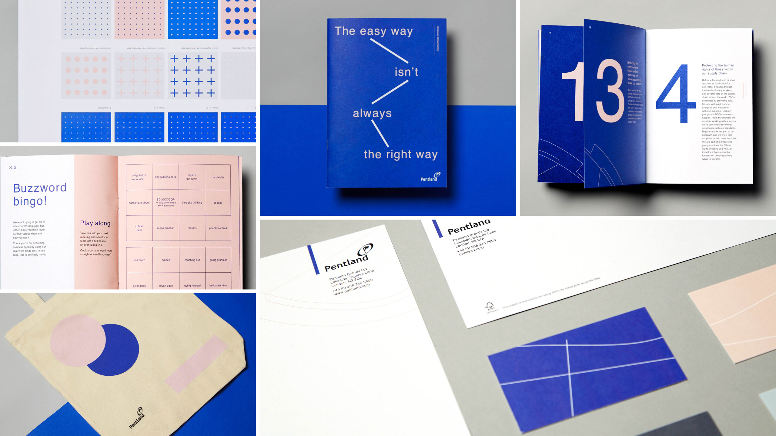
The graphic look and feel was inspired by the work that goes into building brands at Pentland. Taking inspiration from every facet of the business; CAD linework, designs grids, patterns and live data. From this we developed a unique and ownable graphic approach that supports every communication: A visual language that helps bring a message to life, rather than being decorative.
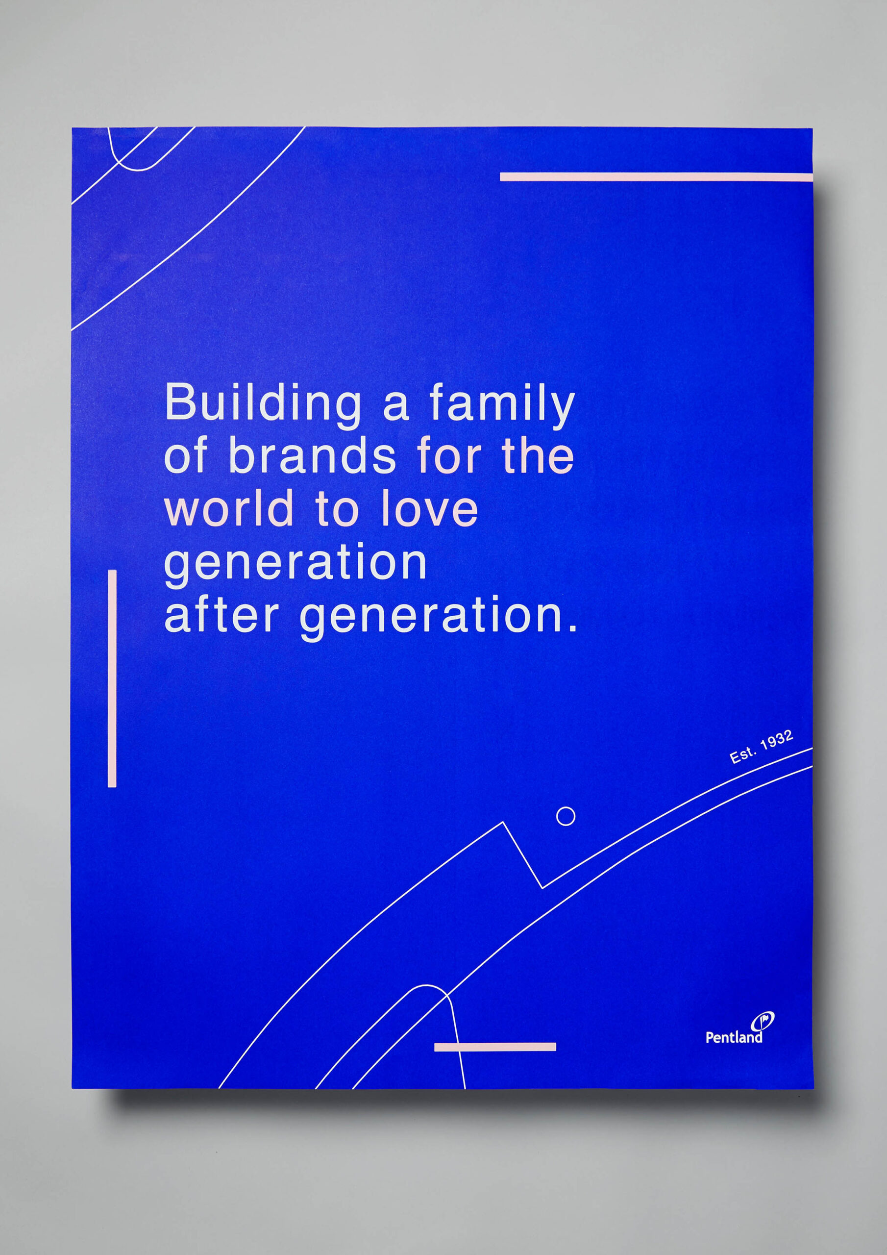
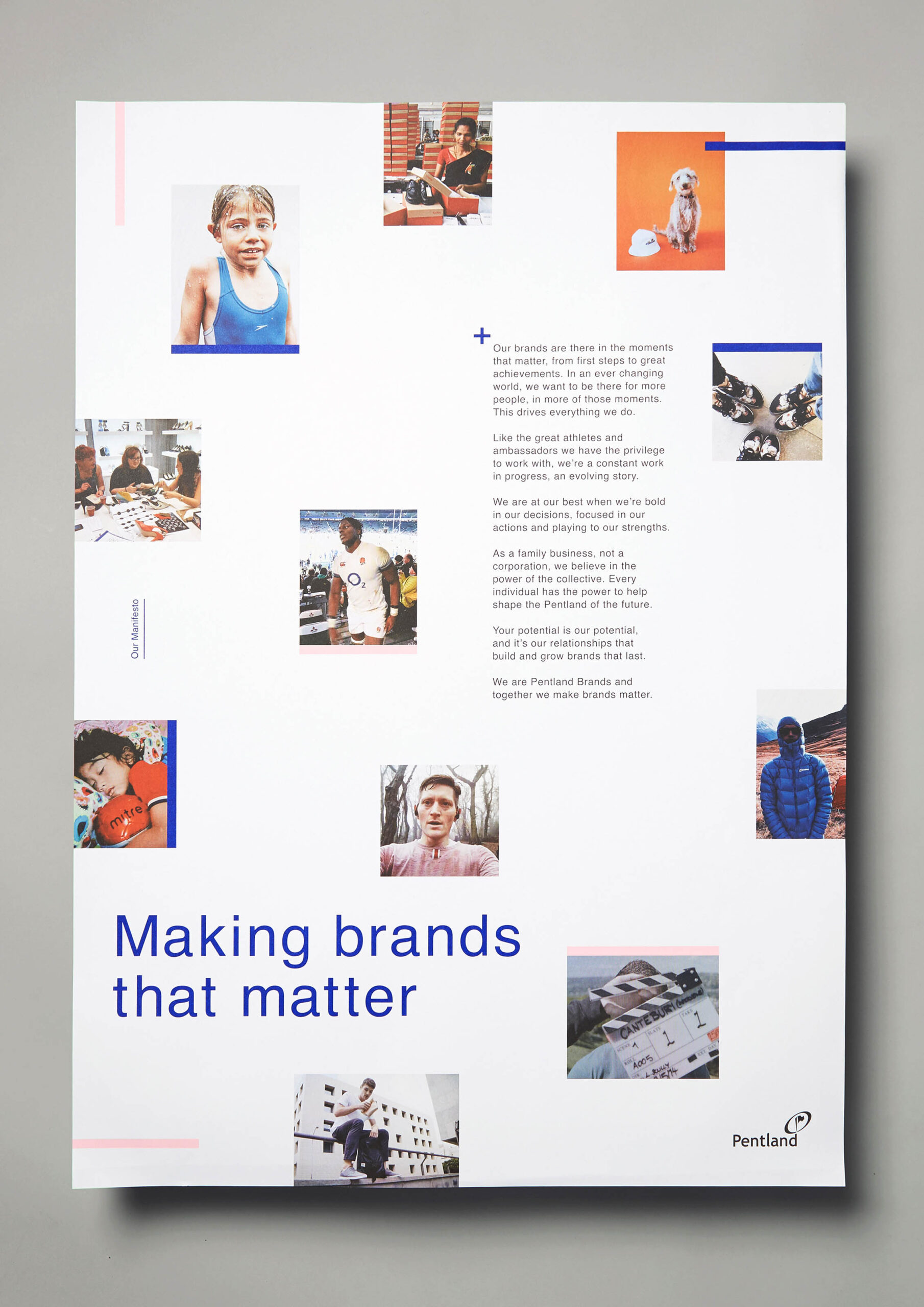
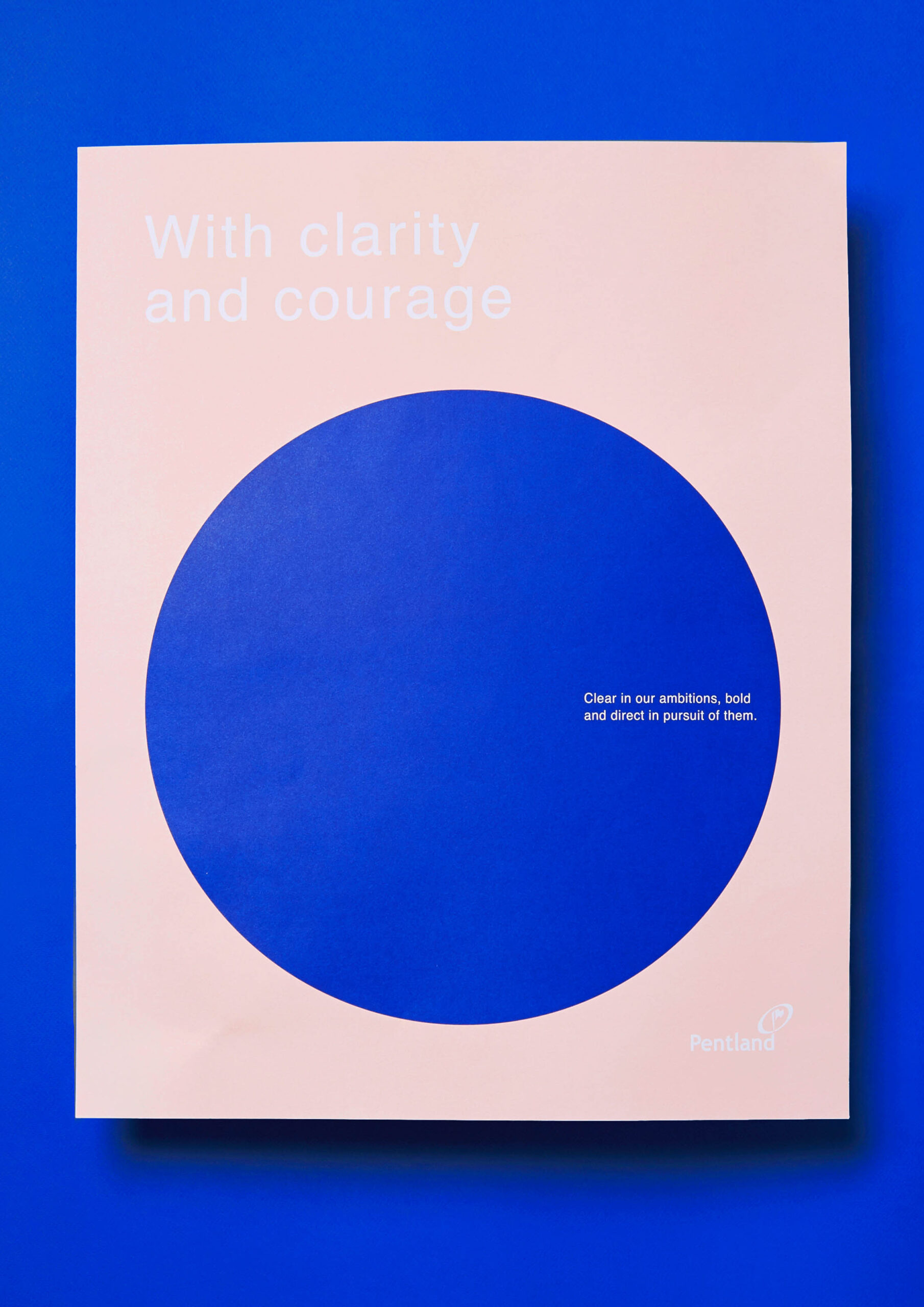
The colour palette incorporated a fresh take on the historic Pentland blue with complimentary tertiary colours designed to evolve season on season.
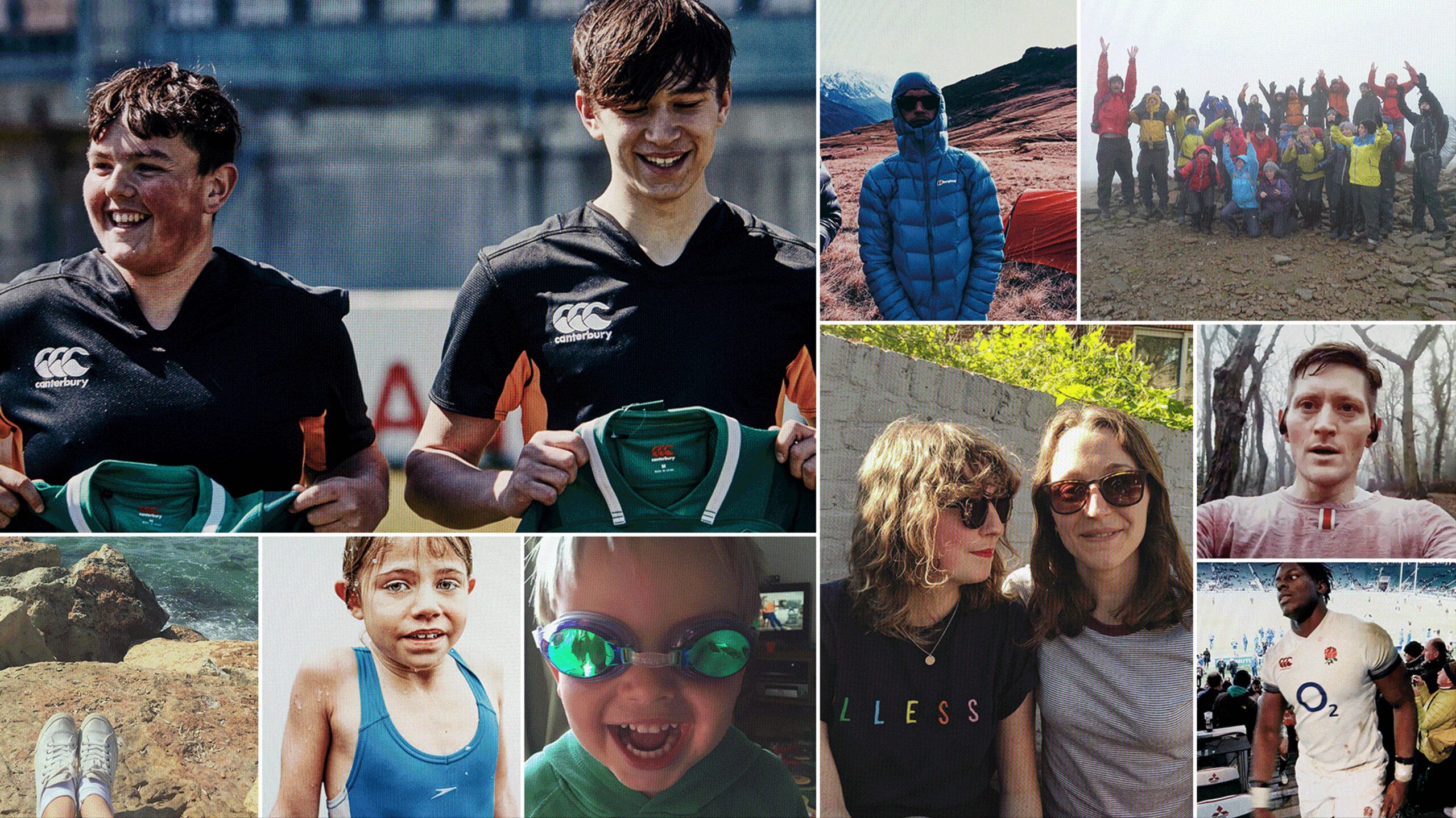
The photography, crowd sourced from the people working at Pentland across the globe, depicts what goes into building brands, making the products and how they are part of our lives and in the moments that really matter to us. To ensure a consistent look the imagery is treated with a screen effect, giving it the feel of a live feed from the world we live in – life unfiltered.
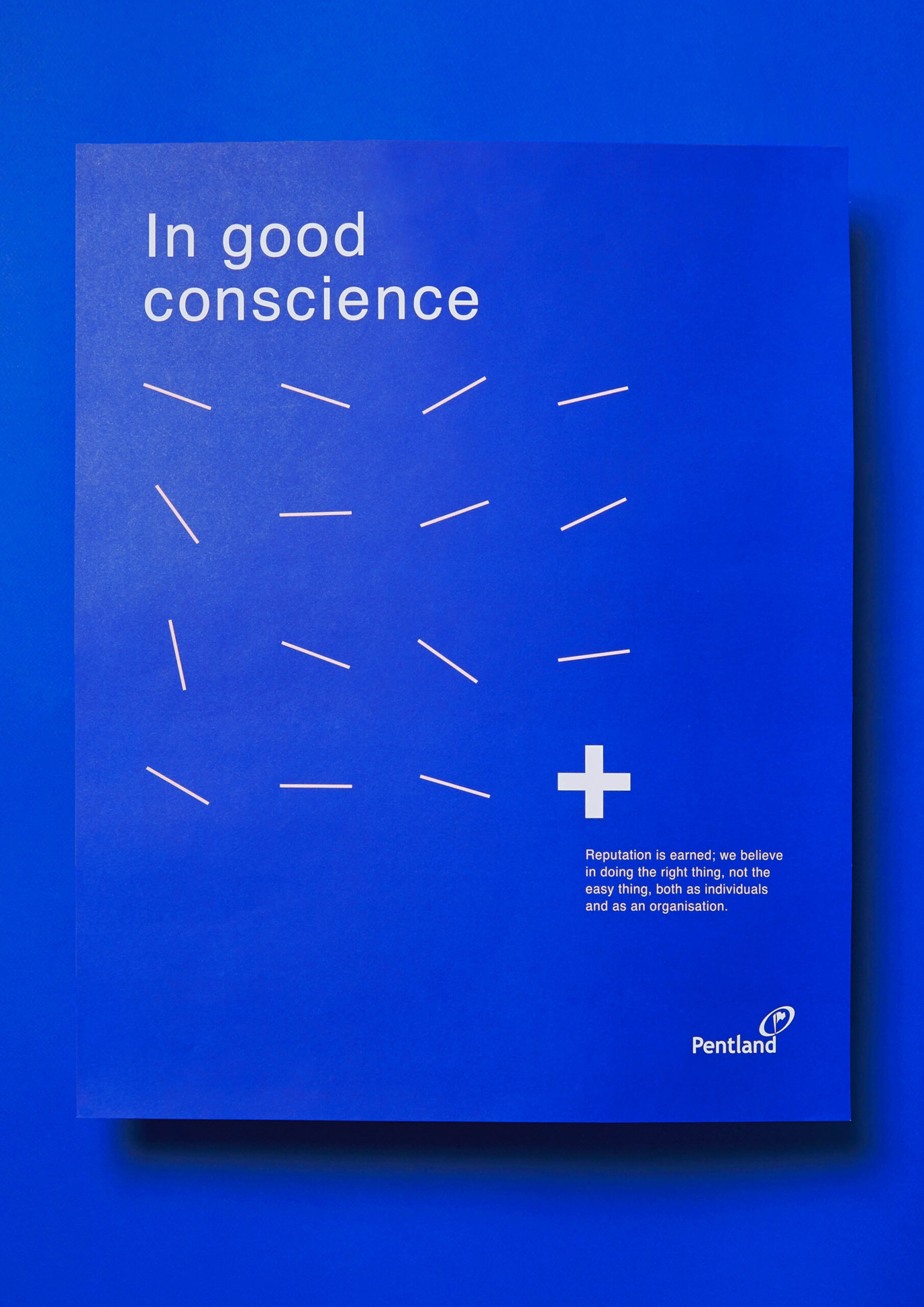
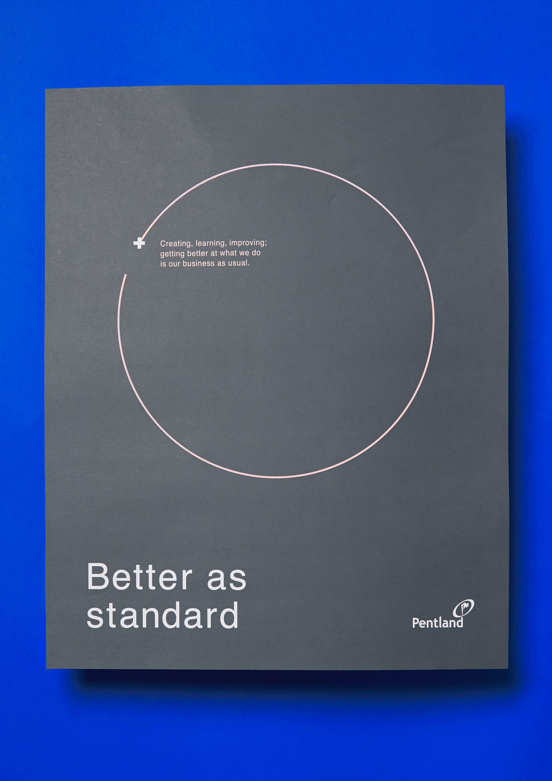
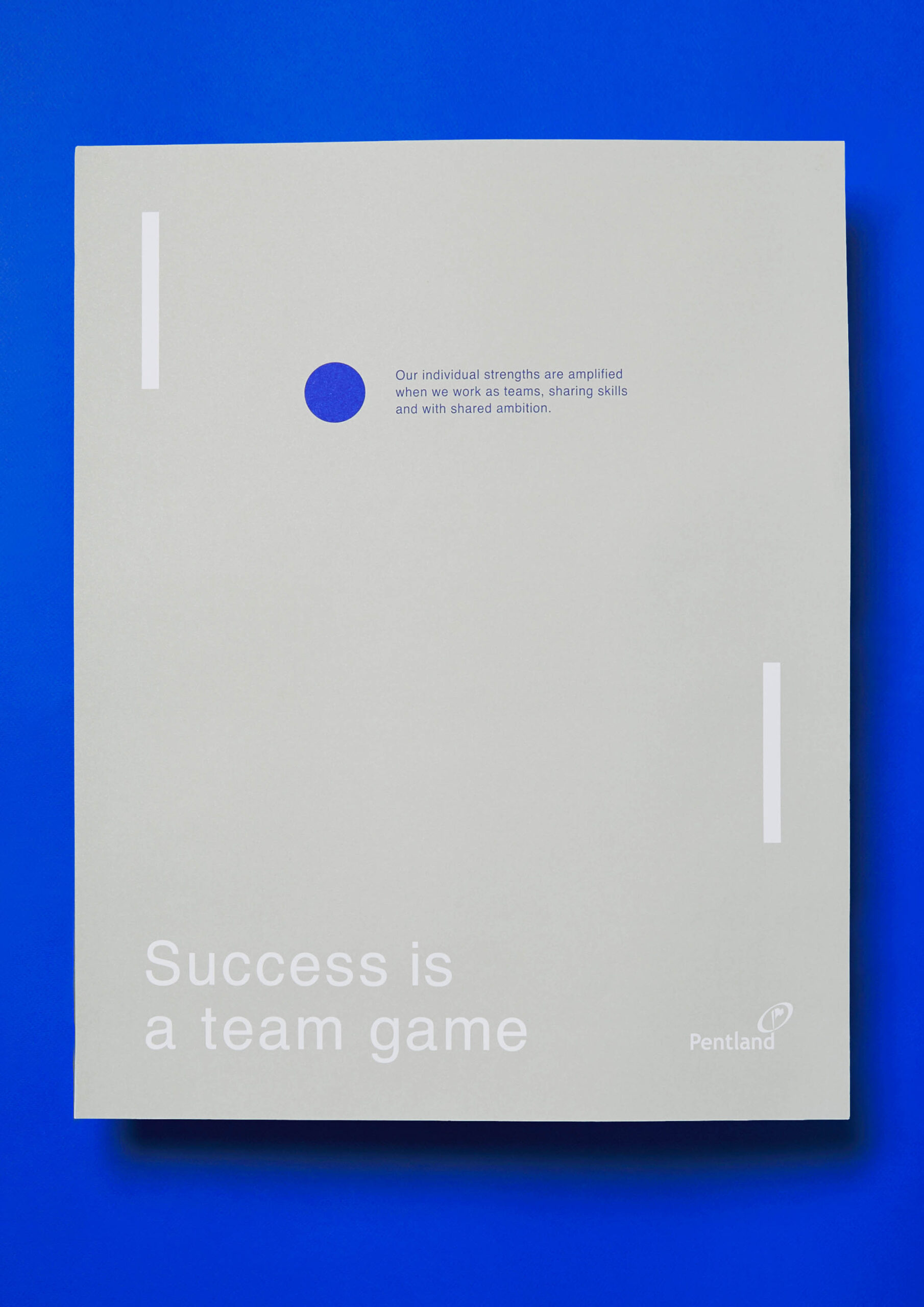
Our tone of voice guide challenged many of the corporate norms and encouraged a straightforward approach to communication. We instigated a more human approach: no more hiding behind business jargon. Rather than ‘labelling’ internal comms, let’s make our copy work harder and say what really matters.
Our approach to typography, in line with our tone of voice, is straightforward, easy to digest and honest.
Credits
Creative Team
Sally Green
Kirsty Hopkins
Jess LeMarchand
Martin Schnabl
Becks Sunderland
Kate Stapleton
Natalie Kelter
Videographer & Editor
Emma Dalzell
Web Developers
Diginut
